What i propose here is a a new challenge only for the open minded.
A way of thinking outside the box and coming up with creative ideas.
Losing trades are rarely discussed here, and more importantly, WHY it was a losing trade. And if it is, the answer is always a conventionally opinionated reason.
If you know when NOT to trade, you will know WHEN to trade.
The markets are dynamic and this is why it is so hard to truly identify a high odds trade from an absolute flop of a trade.
This game is solely intended to inspire people and get them to see (and approach) things from a different angle.
If your open minded, like a good challenge and would like to share ideas, this is the place to be...
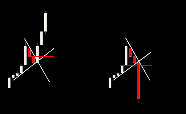
The Picture:
- Both patterns are visually identical.
- One is a winner, the other is a loser.
The Rules:
- Only allowed to use the data right in front of you.
- No bitching, no moaning, no sarcasm.
The Ideas:
- What process you would implement to spot (dissect) the difference?
- Would you use any tecnical tools, if so, why?
- Is there any difference in the data shown above? If so, where do you see it?
- Is there actually enough data in the picture? If not, why?
http://content.screencast.com/users/...20vs%20bad.png
Fire away...
A way of thinking outside the box and coming up with creative ideas.
Losing trades are rarely discussed here, and more importantly, WHY it was a losing trade. And if it is, the answer is always a conventionally opinionated reason.
If you know when NOT to trade, you will know WHEN to trade.
The markets are dynamic and this is why it is so hard to truly identify a high odds trade from an absolute flop of a trade.
This game is solely intended to inspire people and get them to see (and approach) things from a different angle.
If your open minded, like a good challenge and would like to share ideas, this is the place to be...
The Picture:
- Both patterns are visually identical.
- One is a winner, the other is a loser.
The Rules:
- Only allowed to use the data right in front of you.
- No bitching, no moaning, no sarcasm.
The Ideas:
- What process you would implement to spot (dissect) the difference?
- Would you use any tecnical tools, if so, why?
- Is there any difference in the data shown above? If so, where do you see it?
- Is there actually enough data in the picture? If not, why?
http://content.screencast.com/users/...20vs%20bad.png
Fire away...