►►Financial Markets Observatory Lab.◀◀
❖ H! ALL ❖
Some notes/charts about Record High Percent Indicators.
General stocks-benchmarks as follows:
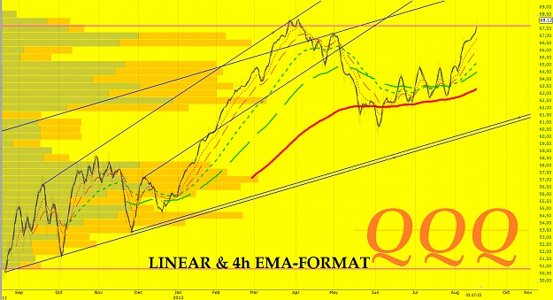
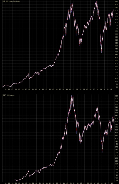
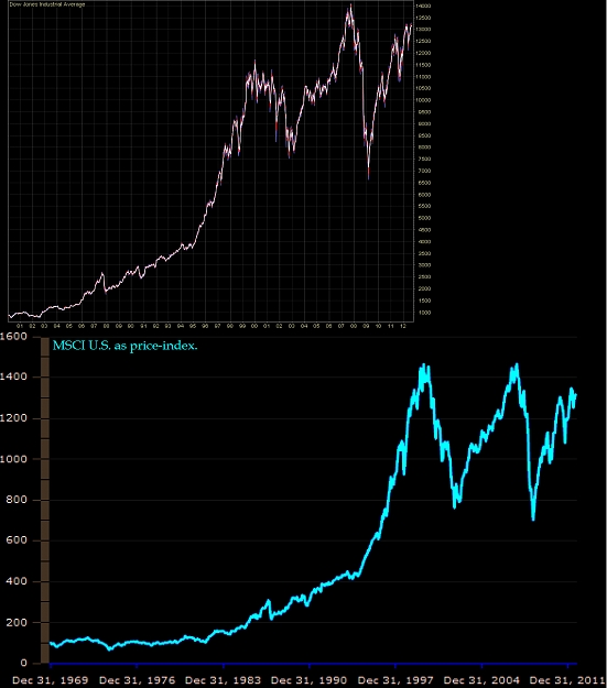
► main U.S. stocks-benchmarks (charts & notes: QQQ; ONEQ; DIA; OEF; SPY);
► global U.S. stocks-benchmarks (charts & notes: EUSA; ISI; IWB; IWV; IYY; TMW);
► global World stocks-benchmarks (charts & notes: ACWI; DGT; IOO; NYSE W.L.I.; ONEF; VT).
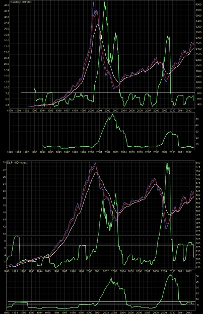
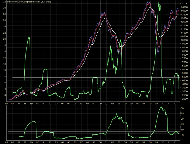
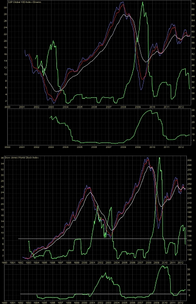
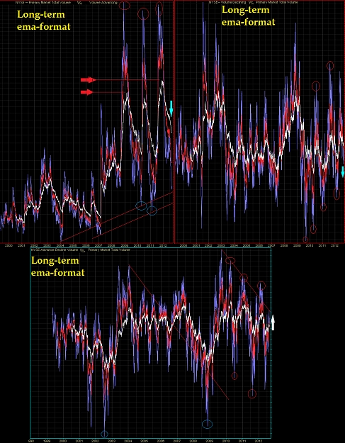
In this post there are some charts about the Record High Percent Indicator (daily & linear long-term ema-format), a breadth indicator, about 'in-phase' vs. underlyings, obtained with the ratio between the number of 52-week highs vs. the sum of the number of new highs & new lows.
The main graphical elements are the followings.
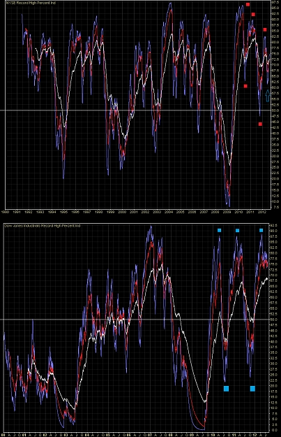
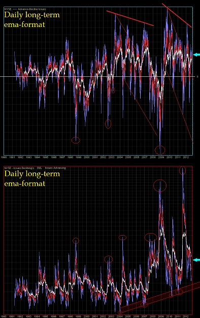
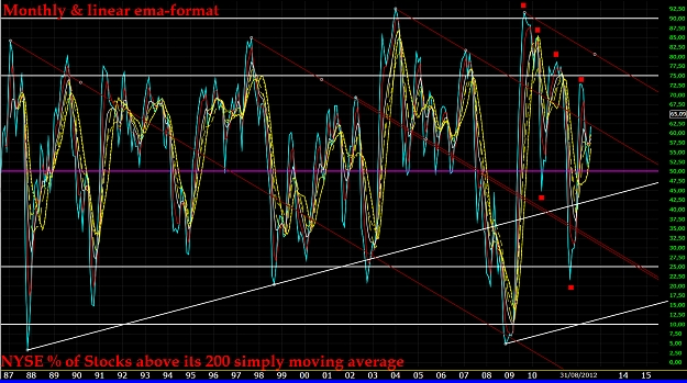
NYSE - Important divergences playing on tops & lows post-2009 (see red squares), with a local (blue-arrow) bullish signal in progress from the recent ema-knot (curve > mid-line).
D.J. - Morphology of curve totally bullish (curve > mid-line, of course).
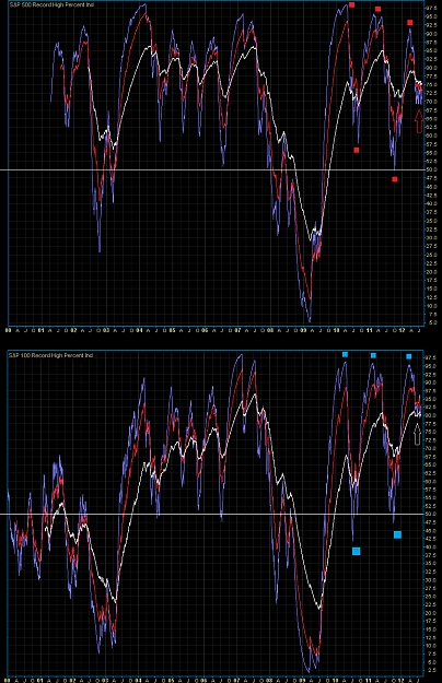
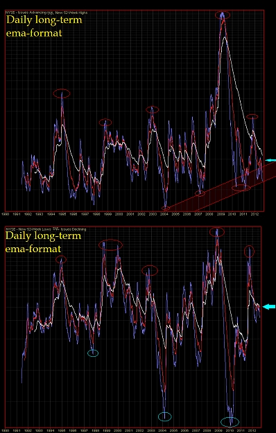
S&P500 - Important divergences playing on tops & lows post-2009 (see red squares), with a local (red-arrow) sell signal in progress from the recent ema-knot (curve > mid-line).
S&P100 - As D.J., but with a local (white-arrow) not-complete signal from the recent ema-knot (curve > mid-line)
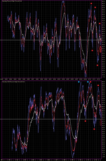
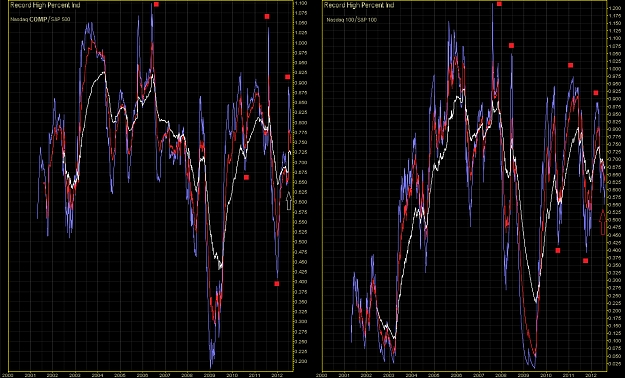
Nd/Comp. - Important divergences playing on tops & lows post-2009 (see red squares), with a local (red-arrow) first sell signal in progress from the recent ema-knot, and a second dangerous signal from the mid-line, full-tested by curve.
Nd/100 - Important divergences playing on tops & lows post-2009 (see red squares), with a local (red-arrow) sell signal in progress from the recent ema-knot (curve > mid-line).
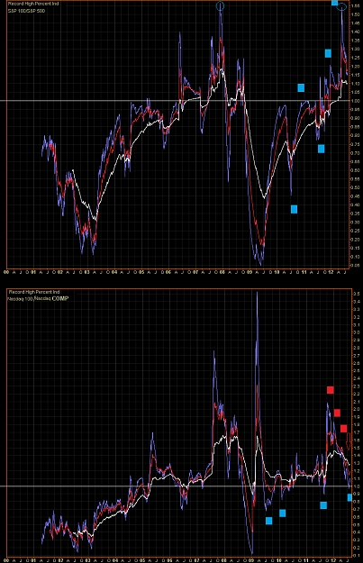
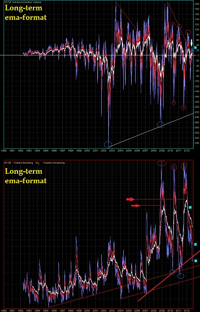
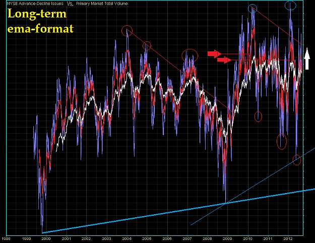
r-Spread S&P 100 vs. 500 - This comparative indicator (inside S&P) shows a wonder 2-tops (blue circles) with a bullish array of recent key-tops & key-lows (see blue squares). Recent ema shows a preliminar bearish-knot 'in progress'. Strength of Record High Percent Index of S&P100 > S&P500 (curve above 1-line).
r-Spread Nd 100 vs. Comp. - This comparative indicator (inside Nd) shows two hard-descending key-tops (2009 vs. 2011), with a bullish array of recent key-lows (blue squares), but a bearish-array of recent key-tops (red squares). Recent ema shows a preliminar bearish-knot 'in progress' (red-arrow) in full-test of 1-line (strength of Record High Percent Index of Nd/100 = Nd/Comp.).
r-Spread Nd/Comp. vs. S&P 500 - This comparative indicator shows an evident bearish-array of recent key tops & lows (red squares). Recent ema-knot with a local (white-arrow) not-complete signal.
r-Spread Nd/100 vs. S&P100 - This comparative indicator shows an evident bearish-array of recent key tops & lows (red squares). Recent ema-knot with a local preliminar bearish-signal 'in progress' (red-arrow).
From these indicators, there are some graphical elements dangerous for the bullish trend of underlying, both in long-term (divergences signalled by red squares), and in short-mid term (local ema-knots).
Alert on these signs for underlyings.
These indicators shows local (2012) bullish signals, but there are some structural divergences (see tops) that should not be neglected.
Sorry for my bad English. I hope that this post is at least minimally useful.
☻/ ❖ Globo.pk, Alert 2.O !!! ❖
/▌
/|
Tuned on main trend, but follows short-medium term signs from underlying prices, for a correct & real-time set-up.
It is very important do not anticipate the main trend of the underlying financial instruments.
Ⓘℳ☢ ℬɣ $@❣♆¥ ►►♥
₭€$AⅅⅅhAPhA'pe'₭AℳℙA' ℬunda-ℬunda €MP¥R€ ❣❣❣
Attached Image(s) (click to enlarge)