- Search Crypto Craft
- 708 Results
-
 alphac replied Jul 20, 2020
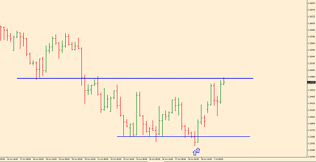
Would like to see a return to this area to look for a buy, the first return to it was brief. image
james16 Chart Thread
- alphac replied Sep 4, 2019
Pinbar needs to be at the bottom (or top) of a move in price. Confluence always helps. GBPUSD Daily pinbar yesterday, at the bottom of a move in price, recent support, big round number confluence, nice shape pin (long wick), closed inside body of ...
james16 Chart Thread
- alphac replied Jul 2, 2019
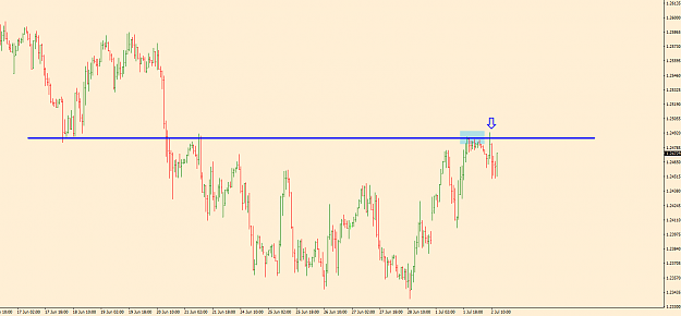
GBPCHF 1hr chart, a follow on from the GBPCHF discussion. This is the 1 hr chart again, price was held in the blue shaded area, then price moved higher and fell back. There was no obvious PA on the 1 hr, there is a 2 bar pinbar, but the close was ...
james16 Chart Thread
- alphac replied Jul 1, 2019
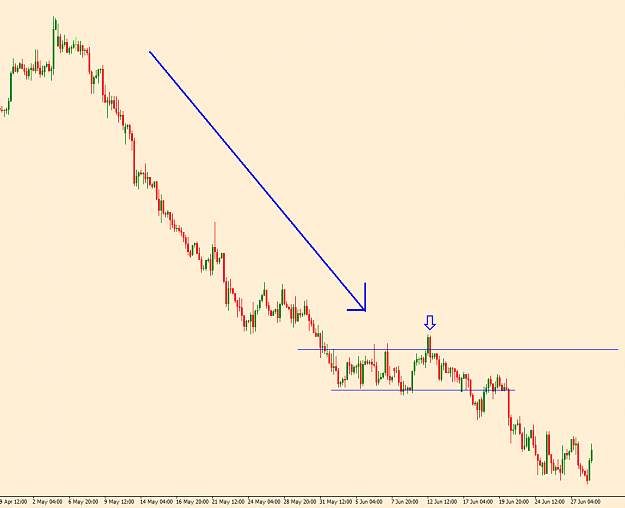
A quick example of the breakout scenario you eluded to. Once price has broken out of the resistance it returns three times, the localisation, then the large BUOB. image
james16 Chart Thread
- alphac replied Jul 1, 2019
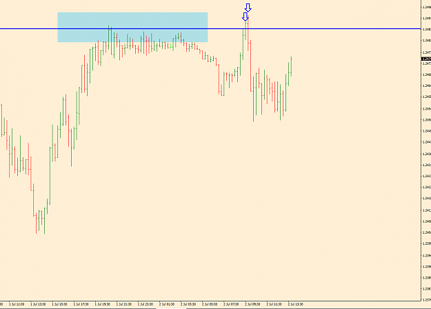
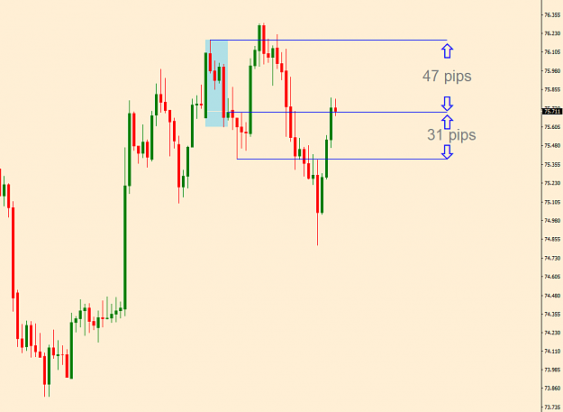
I always like to see these S & R areas hold price first, then look for PA, like in my post above, price tries to breakout but can't. This the same box on GBPCHF 1hr, showing a 2 bar pinbar doing just that. image And the 4hr chart showing a 2 bar ...
james16 Chart Thread
- alphac replied Jun 28, 2019
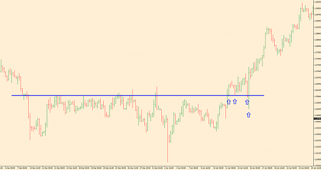
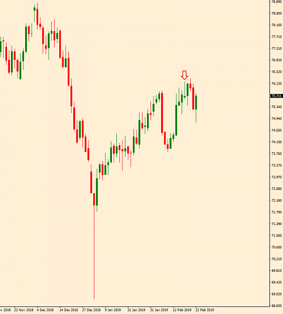
Somewhere where I would also look to buy as price failed to move lower, this 4 hr chart shows the downward bias, big drop in price and the two bar pinbar (arrowed) showing price unable to get above the top resistance/flip line. I would still of ...
james16 Chart Thread
- alphac replied Feb 24, 2019
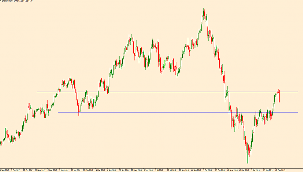
The pinbar isn't the same on my feed. Pinbars don't just work, all a pinbar shows is that price has retraced from an area, there are lots of other things to consider, they've been repeated enough on here so I don't think I need to tell you. It's ...
james16 Chart Thread
- alphac replied Feb 16, 2019
UK FTSE 100 Daily, watching this also, several areas worth keeping an eye on. image
james16 Chart Thread
- alphac replied Feb 12, 2019
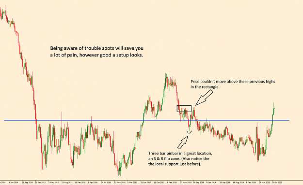
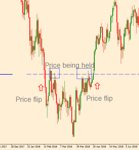
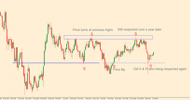
A close up of the area around the price flip marked above but on the daily chart, notice when price breaks down and then up through the S & R area at the price flips, the size of the candles when price breaks away, the large candles, you know it's ...
james16 Chart Thread
- alphac replied Mar 22, 2018
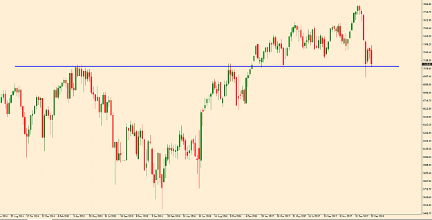
UK FTSE 100 Weekly chart. The FTSE carries on it's decline, no matter how good the PM makes the employment figures sound, the high street is in a bad way with what seems almost daily stories of major retailers struggling. Would be no surprise to see ...
james16 Chart Thread
- alphac replied Mar 1, 2018
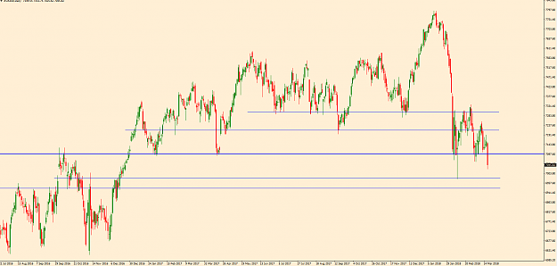
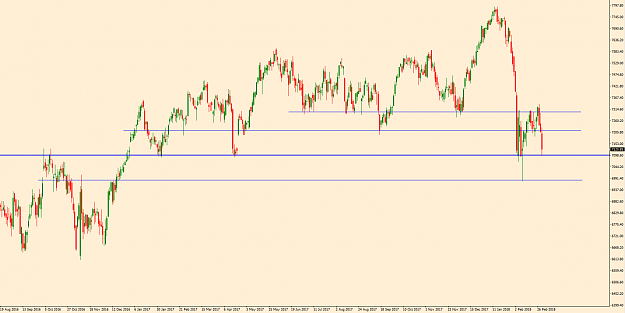
UK FTSE 100 Weekly chart, still showing respect to the S & R area... image ...and the Daily chart to show a bit more detail. image With the GBP showing weakness and the economy looking in bad shape maybe we'll see further falls, the previous ...
james16 Chart Thread
- alphac replied Feb 5, 2018
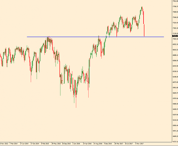
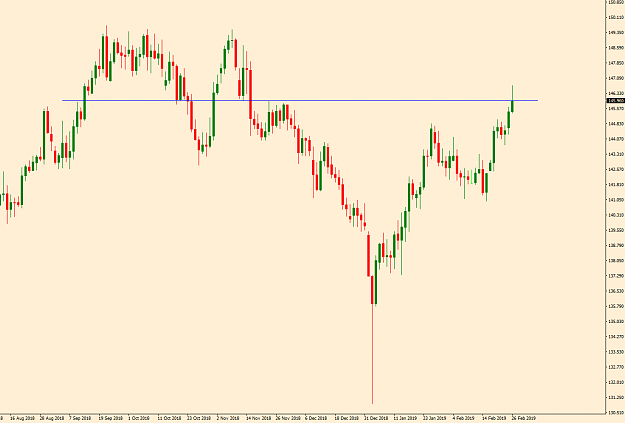
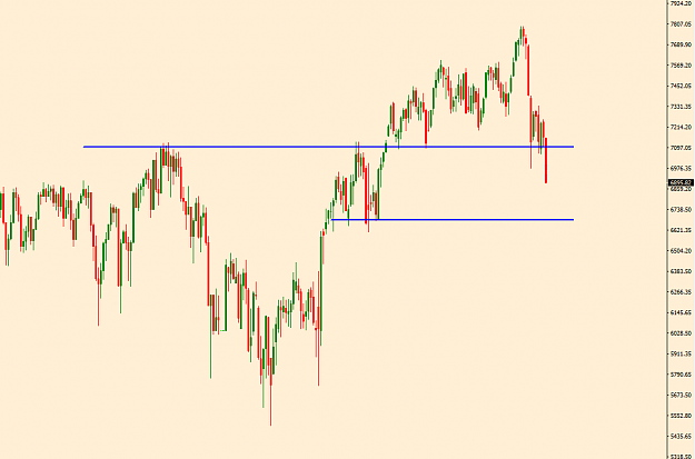
UK and US indicies are having a bad time. FTSE 100 Weekly chart image
james16 Chart Thread